going to post my stationery painting progress here...somewhat secretly...i want to see them all together and think about what i like/dislike about each of them...because i'm really feeling like crap about some of them, but i just need to like identify what's good and apply it to the next revision of the same painting! i also want to be able to FACE MY CRAPPY ART! so! here 'tis.
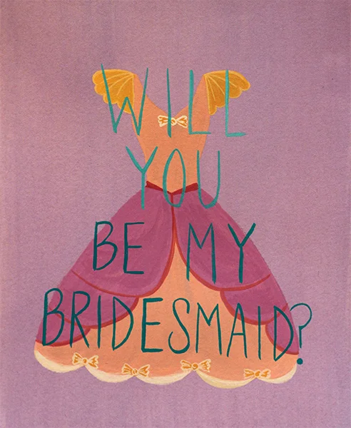
my idea was to have like a really ugly, ruffly, poofy dress covered in bows and shit... got some feedback that the dresses were too pretty. so if/when i redo these, i'll try to make the dresses more disgusting.


rev1 - babies don't talk, so rev2 says "kid", also ran out of room on swears! :(
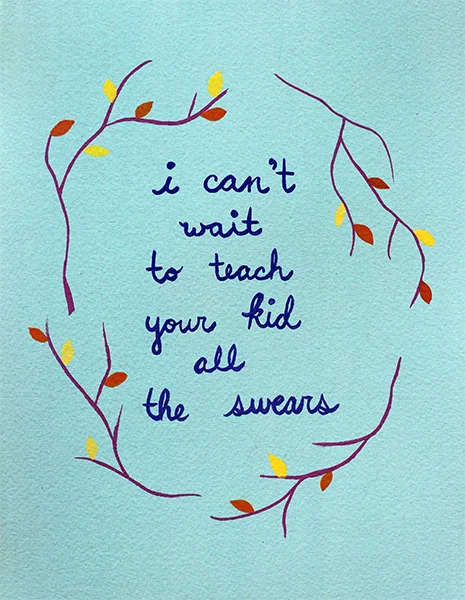
for rev 2, i got the bright idea to paint the words BEFORE the surrounding branches...but i totally hate how my handwriting (handpainting?) came out in this. i need to keep practicing. there will be a rev3...
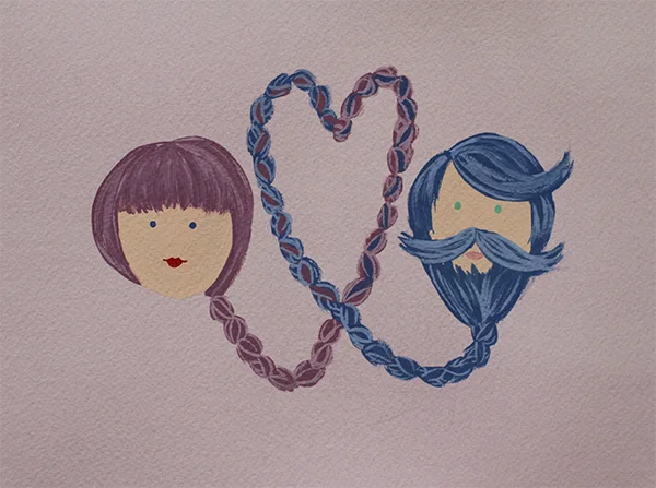
i'm pretty happy with this... i want the girl braid to bottom out where the guy beard braid bottoms out but that's about the only thing really bothering me here.

rev 1 - i should've snapped a picture of this before i painted the rainbow "ya herd" in the lower left corner (i wasn't sure what colour to use for the words on rev 2...) anyway... i would like the dots more if they had been more uniform. i think i was unhappy with it from the moment i started painting the words.
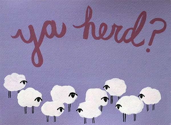
rev 2 - i think the sheep are cute <3 and i think it makes more sense to have a bunch of them, that's how i originally sketched it anyway! i'm like...somewhat happy with this...

i need to practice painting jewels. this totally sucks. i also think the jewels just floating around is so straight forward... i don't know... i'm going to keep thinking about it. i tried to do jewel writing and it looked like CRAP! i JUST remembered in the old school disney animated sleeping beauty i think there's jewel font in the book before/after they get to the animation part...gonna check that out before i try the next one!
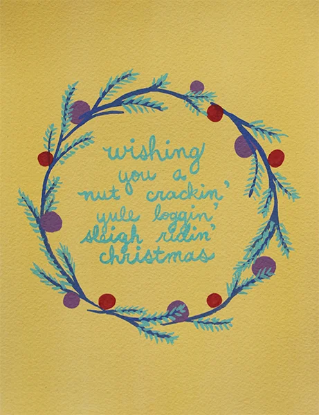
i hate the wreath (BORING!), i hate the colours, i hate that my lettering is all janky and overlapping awkwardly. did i mention i hate the colours?! note to self - DO A COLOUR PALATE FIRST.
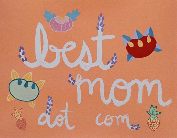
i painted the lettering first...and i didn't like it, but i decided to just practice painting these cute little japanese things... this is FOR SURE going to get a rev 2...